Selected work / Optimize Nutrition
A brand you feel.
A store you can use.
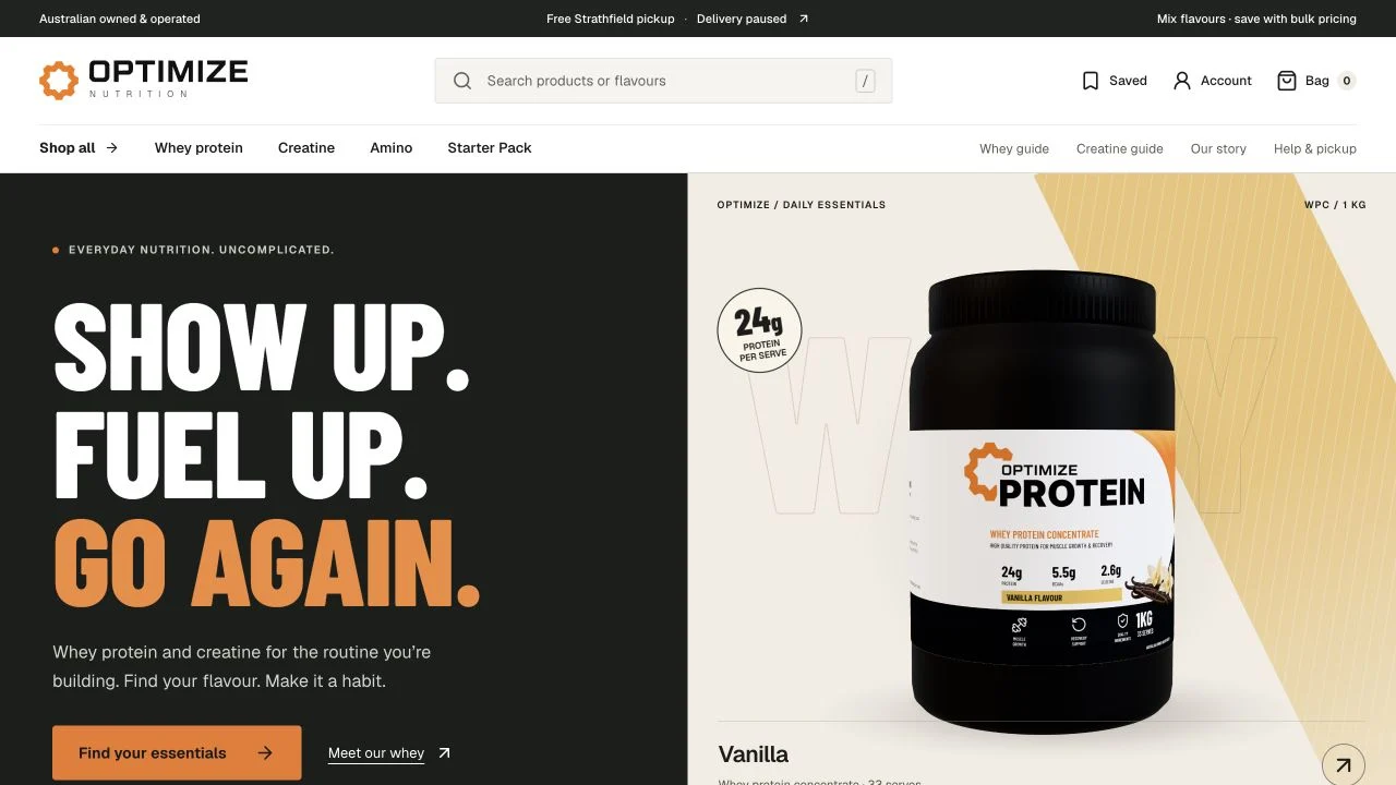
We designed and built a custom supplement storefront for Optimize Nutrition, connecting a bold visual identity to product discovery, clear product information and a practical shopping journey.
- Business
- Australian nutrition brand
- Our role
- Design & custom development
- Experience
- Catalogue, products & bag
- Content
- Buying guides & product education
01 / The brief
Give the product room to speak.
A supplement store needs more than a grid of tubs. Visitors need to compare flavours, understand serving information and find the details that matter before deciding what fits their routine.
We built a distinctive, product-led storefront with bold type, warm orange accents and clear routes from the range to individual products. The same system carries through category pages, buying guides and practical pickup information.
02 / What we built
One product.
Connected parts.
- 01
A distinctive storefront
A custom homepage, flavour previews, product imagery and category filtering make the range easy to explore while giving the brand its own visual identity.
- 02
Useful product pages
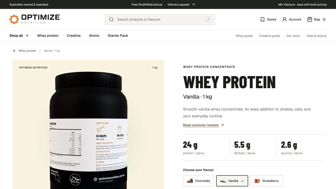
Flavour navigation, pack information, serving details and expandable ingredients and allergen sections help visitors compare the actual products, not just the packaging.
- 03
A connected bag flow
Product selection, quantities and a shopping bag connect browsing to order preparation. Availability and ordering states follow the live catalogue, keeping the experience clear when a product is not yet available to order.
- 04
Content built for discovery
Dedicated category pages, product-specific questions and buying guides create useful search entry points. Consent-aware analytics helps the business understand product views and bag actions while respecting visitor choices.
03 / In the details
The details do the selling.
We gave each product its own usable page: clear imagery, flavour switching, serving information and practical answers. Product education and the live catalogue sit in the same journey, so visual impact doesn't come at the expense of clarity.
04 / The delivery
Brand and buying journey. Together.
The result is a connected public storefront: homepage, catalogue, detailed product pages, bag experience and supporting content, all designed as one system across desktop and mobile.
Visitors can move from discovering a flavour to understanding its ingredients, comparing options and preparing their bag without losing the thread. Product education and the shopping interface work together, with availability clearly reflected throughout the journey.